You set up a home studio so you can make creative choices that hold up outside your room. Small shifts in hue can change skin tones, brand marks, paints, fabrics, and finishes.
Color appearance depends on three things: the light’s spectral mix, how materials reflect that mix, and how your eyes see it. Color rendering describes how a lamp affects what you see.
In practical terms, color rendering for work means your materials look the same in the gallery, on camera, or in daylight. High cri lamps raise fidelity and cut surprises when you move from studio to client view.
CRI is vital, but it is not the whole story. Intensity, placement, and room surfaces also change perceived color. This article will show you what CRI and Ra mean, why CCT matters, how to pick targets, and simple tests before you buy.
What “color rendering” means in a home studio environment
In a home studio, light changes how your materials look more than you might expect. Color rendering is simply the way a lamp affects the appearance of an item. Different bulbs give different spectral mixes, and that changes what wavelengths get reflected from an object.

How a light source changes appearance on materials
A single light source does not add pigment; it limits which wavelengths reach your eye. That means two equally bright lamps can make fabrics or paints look very different.
Why the same object can look different under different light sources
You’ve probably seen a swatch look warm under a desk lamp and neutral by the window. LED bulbs, overhead fixtures, and daylight each have unique spectral patterns. Those patterns feed or starve specific reflectances, so a red mix may seem rich under one LED and dull under another.
- Translate to practice: a warm gray may read greenish under one bulb and neutral under another.
- Don’t judge pigments by brightness alone—spectra matter.
- Accurate rendering reduces rework like repainting or reprinting.
How you actually see color while you work
Seeing true tones at your desk is a chain reaction: light strikes a surface, some wavelengths bounce back, and your vision decodes the result.

Spectral distribution of the light hitting your materials
The spectrum of a lamp describes which wavelengths it emits. A smooth, continuous spectrum tends to show a wider range of hues naturally than a spiky one.
Spectral distribution is the simple chart that tells you which parts of the spectrum are strong or weak. That chart predicts how well subtle tones will appear.
Object reflectance and material finishes that shift perceived color
The light that reaches your eye is the product of the lamp’s spectrum and the object’s reflectance. Different materials bounce back different mixes of wavelengths.
Finishes change behavior too: gloss flips light into highlights, matte scatters it, and metallics create angle-dependent shifts. The same paint can look cleaner on a matte card and muddier on a satin wall.
Human vision and why perception isn’t purely “objective”
Your brain interprets signals based on context and prior expectations. Two identical swatches can read different if a nearby surface biases your eye.
- Break the pipeline into three controllable parts: lamp spectrum, object reflectance, and your visual system.
- Understand that spectra shape how hues appear and that finishes alter lightness and tint at different angles.
- Remember your vision’s adaptive ability; it normalizes scenes and can mask true differences.
These factors explain most of the variation in color appearance you see while you create. Next, you’ll learn how adaptation changes those judgments over time.
Chromatic adaptation and why your eyes “correct” lighting over time
Your eyes quickly tune into the dominant tint of a room, and that shift changes what you accept as neutral.
Chromatic adaptation acts like your built-in white balance. After a few minutes under a different lamp, your cones shift sensitivity so neutrals look neutral again.
Switching from daylight-style fluorescent lamps to incandescent light
As an example, white paper under daylight-style fluorescent lamps looks normal. Move to an incandescent lamp and that same sheet can look yellow-red at first.
Within minutes, your vision re-stabilizes and the sheet appears white again. That quick reset helps you keep creating without constant doubt.
Why cameras can disagree without white balance
A camera with fixed settings will record the warm scene as orange. Auto white balance tries to mimic your adaptation, so photos often look closer to what you see.
Practical note: if you sell or document pieces, match your lighting and camera settings. Otherwise images can mislead buyers even if your eyes say the piece is correct.
- Adaptation hides spectral gaps, so a poor source may seem fine in your studio.
- Use consistent light and camera white balance when you capture images.
- CRI helps compare sources by estimating fidelity after adaptation.
Color Rendering Index explained in plain English
A simple score can tell you how closely a lamp matches a trusted reference when it shows pigments and textiles.
The CIE color rendering index (CRI) rates how faithfully a light source reproduces hues compared with a reference light of the same correlated color temperature.
CRI as a fidelity score compared with a standard source
CRI gives you per-sample values (Ri) up to 100. Each Ri compares a test color under your lamp against that same color under a reference source.
What a CRI value of 100 really represents
Ri = 100 means the test color matched the reference exactly in the lab method. Both sunlight and incandescent sources are common 100 references at their matched CCTs.
- Practical definition: CRI is a score that tells you how faithfully a light renders colors compared to a matched reference source.
- Meaning of fidelity: if you mix a paint under this lamp, it should look essentially the same under the appropriate reference.
- Why it matters: use high CRI when choosing brand swatches, matching fabrics, approving finishes, retouching photos, or judging skin tones.
- Scale note: moving from cri 80 to 90 is often noticeable; 95+ suits stricter accuracy needs. cri 100 is perfect by the test, not an absolute guarantee for every task.
Next, you’ll see how that headline number is built from many Ri values and why the Ra average can hide weaknesses in specific hues.
How CRI is calculated and what “Ra” actually averages
Think of CRI as a report card made of multiple subject grades rather than one final mark. The index is built from preset test samples that each produce an individual score called Ri.
Each Ri is calculated from the measured color difference after adaptation using this method: Ri = 100 − 4.6·ΔEi. That means a small color shift gives a high Ri; a large shift drops the score quickly.
The familiar Ra value is simply the average of the first eight Ri scores (R1–R8). Those eight samples are moderately saturated, so Ra can read well even if some saturated reds or deep blues lag behind.
When individual Ri values matter
If you paint or photograph strong reds, skin tones, or saturated blues, check the Ri set rather than relying on Ra alone. A lamp with good Ra may still show weak performance on crucial hues.
- Practical tip: ask suppliers for Ri data or test your own swatches.
- Tradeoff: Ra is useful for quick comparison, but detailed Ri values reveal spectral holes.
- Next step: compare CRI at the same CCT so the index stays meaningful.
Color temperature and daylight: why CRI comparisons must match conditions
Pick a light’s temperature as deliberately as you pick paper stock — it sets the context for every color decision.
First measure the lamp’s correlated color temperature (CCT). That CCT decides which reference the CRI test uses and changes how materials will look under that lamp.
How correlated temperature determines the CRI reference source
CCT is a shopping shorthand: lower kelvin reads warm, higher kelvin reads cool or daylight-like. Test labs measure CCT, then compare the test source to a matched reference.
Daylight reference vs. blackbody reference and what that means
If CCT is below 5000 K the comparison uses a blackbody (incandescent-like) reference. At or above 5000 K the reference switches to CIE daylight. That switch changes which spectral gaps matter.
Why listing CCT alongside CRI prevents misleading comparisons
Two lamps with the same CRI but different CCTs can give very different impressions and comfort while you assess materials. Always read CRI and CCT together.
- Rule to shop by: choose a CCT that matches your output environment, then optimize CRI within that CCT.
- High CRI claims are meaningful only when paired with the intended viewing conditions.
- Once you pick the temperature “look,” decide what CRI value suits your tasks and move to target selection.
Color rendering for work: choosing the right target CRI for your creative tasks
Choose a target CRI based on how costly a color mistake will be and how precise you must be. Your target should match the job: studio tests, client approvals, or casual projects.
When CRI 80 is sufficient and when it falls short
CRI 80 is a solid baseline. It suits general room lighting, hobby craft, and tasks where approximate hue is fine.
But 80 can hide shifts in saturated reds or subtle skin casts. If reprints or touch-ups cost time or money, aim higher.
When high CRI or CRI 100 is worth the premium
Move to cri 90–95+ for product photos, portrait retouching, textile selection, and brand color checks. These values reduce surprise when pieces leave your space.
Use cri 100 only if you need maximal fidelity at a given temperature and you routinely judge fine hue differences.
How better fidelity helps skin tones, pigments, and finishes
High cri lighting preserves natural skin tones, keeps pigments truer, and reveals undertones in finishes. That makes approvals faster and edits fewer.
- Decision framework: weigh cost of mistakes against lamp value.
- Practical note: combine high fidelity with proper illumination and intensity so details and texture are visible without eye strain.
- Result: clearer judgments, fewer surprises, and smoother client sign-off.
CRI vs. gamut and saturation: fidelity vs. “making colors pop”
Some lamps are tuned to make hues pop; that punchy look is intentional, not always truthful. You need to know the difference so your edits, samples, and client approvals behave across settings.
Why CRI focuses on fidelity rather than saturation
CRI measures how faithfully a source reproduces a set of muted test patches. It rewards accuracy: the closer a lamp matches a reference, the higher the score.
By design, the metric emphasizes faithful reproduction, not how vivid something looks. That makes CRI a practical guide when you must predict appearance outside your room.
How oversaturated lighting can mislead artwork decisions
Gamut and saturation metrics look at many colors and can be engineered to boost punch. That trick makes merchandise or prints catch the eye, but it can lie about true balance.
- Core distinction: CRI rewards accurate reproduction; saturation-driven lights boost pop at the cost of truth.
- Studio risk: oversaturated lamps push you toward under- or over-correction, so work later looks flat under normal viewing.
- Concrete example: a deeper red lamp can make a paint mix read perfect there, yet the same mix may look brown or muddy in daylight.
- Client impact: your goal is predictable appearance across environments, not a one-fixture spectacle.
Quick guideline: prioritize high-fidelity sources when you judge art, design comps, and skin tones. Save saturation-boosting fixtures for display, not decision-making.
Next, you’ll compare common home light sources and the differences you’ll notice in practice.
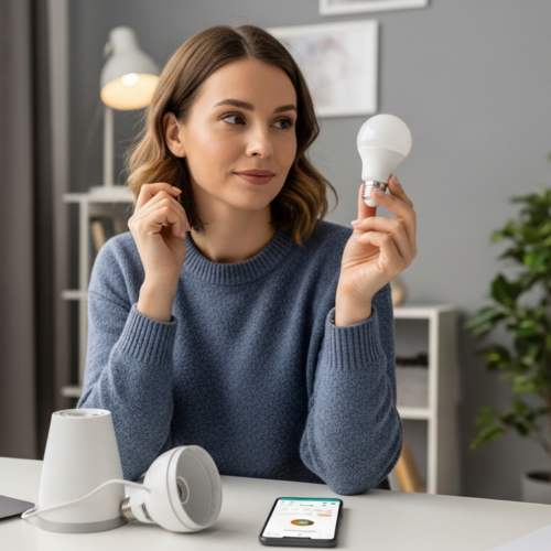
Common light sources at home and the differences you’ll notice
The lights in your rooms are not equal: each source changes tones and mood in predictable ways. That matters when you judge swatches, skin, or prints.
LED choices and what the spec sheet tells you
LED lighting is now the typical home option. On the spec sheet look for CRI (Ra), CCT, and any Ri data. These numbers predict how a light source will treat subtle hues.
Fluorescents and their visible spikes
Fluorescent lamps can feel bright and efficient but have spiky spectra. That means some pigments may shift even if the space looks well lit.
Incandescent-style warmth as a familiar benchmark
Warm, incandescent-like bulbs approximate a blackbody spectrum. That continuous spectrum often feels natural and is still used as a reference in tests.
Daylight as the final truth test
Daylight is the historical standard. Use natural light near a window when you need a final check, but remember it changes by time and weather.
- Compare what you use now: LEDs, leftover fluorescents, occasional incandescent-style bulbs, plus daylight.
- Choose high-CRI LED options to balance accuracy and energy efficiency.
- When possible, verify samples under both a chosen artificial source and daylight as an example of a final check.
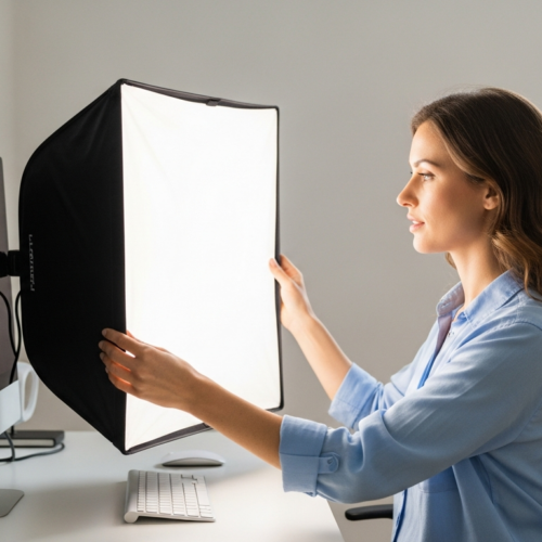
Lighting setup factors beyond CRI that affect your color decisions
Beyond spectrum scores, the way you place and aim lamps shapes every decision at your table. CRI helps, but it can’t fix poor geometry, weak brightness, or a distracting backdrop.
Illumination level and intensity
You need sufficient illumination and even intensity to see subtle transitions and texture without eye strain. Low light hides undertones and fools judgment; too much glare washes out detail.
Set a steady work plane lux level that suits detailed drawing, retouching, or sample checks so your eyes stay consistent through a session.
Placement, shadows, and direction
Light angle changes how an object reads. Raking light makes texture pop and can exaggerate hue shifts.
Top-down or diffuse lighting flattens texture and may hide small mismatches. Side light deepens shadows that shift local appearance.
Environment and surround colors
Nearby surfaces and objects bias your perception. A saturated wall or bright desk will nudge what your eye treats as neutral.
Control the environment by using neutral surfaces near your sample and removing strong-reflecting items while you judge matches.
- Why CRI isn’t enough: perfect spectral fidelity can be undone by poor placement, harsh shadows, or low illumination.
- Shadow management: avoid mixed-color shadows by using matched sources and modest fill light to reduce local shifts.
- Practical takeaway: aim for consistent lighting geometry, steady intensity, and a neutral-ish surround to stabilize decisions.
How to test lighting at home with real materials before you commit
Before you buy a new lamp, test it on the actual materials you use every day.
Screens and spec sheets are useful, but they often miss subtle undertones and finish interactions. Sampling beats digital rendering because you see how pigments and textures behave under living light.
Why sampling beats renderings when judging real-world appearance
Digital previews compress spectra and hide metamerism. A fabric or painted panel may shift under real lamps while the screen shows no change.
How time of day and daylight shifts can change what you approve
Daylight changes by time of day. A match approved at midday can look different at dusk. Check samples at multiple times to avoid surprises.
A simple comparison method using your actual objects and swatches
- Place the same objects and swatches in one spot.
- Light them with your current lamp, then swap to the candidate lamp using the same geometry.
- Compare side-by-side, then view under daylight at a set time.
Document results with photos using a fixed white balance and keep notes. Buy or keep the lamp that produces the fewest surprises across your most common lighting conditions and real objects.
Practical shopping checklist for high-CRI home workspace lighting
Choosing lamps is easier when you know which specs truly affect how your samples will appear.
What to verify: CRI/Ra, Ri data, and color temperature
First, check the CRI and the advertised Ra on the label. Those tell you the basic fidelity of the source.
Confirm the stated color temperature in kelvin. CRI comparisons mean little without matching the same temperature reference.
If available, scan the Ri values or extended metrics. Ri details expose weak hues that an Ra average can hide.
How to avoid “high CRI” claims that don’t match your use case
Watch for vague marketing. A claim of “high CRI” without an Ra number and a kelvin value is not enough.
Ask to see the spec sheet and any index or Ri data. Test with your real swatches when possible.
Balancing quality, energy use, and performance for daily tasks
Pick stable, matched sources rather than mixing many temperatures. Consistent geometry improves judgments.
- Prioritize high quality LEDs that list Ra plus Ri or extended values.
- Balance energy efficiency with the needed brightness and spectral stability.
- If you shoot portraits, favor natural skin-tone fidelity; for prints, choose neutral, predictable output.
Conclusion
Your final judgments depend as much on the lamp you choose as on the samples you test.
Good lighting reduces surprises by aligning your view with real-world conditions. The color you see while you create comes from the light source, your materials, and your vision.
Use CRI as a practical index to estimate fidelity when you match CCT. Remember that an Ra average can hide weak hues, so check Ri data or test with your own objects.
Pick a temperature that matches typical viewing conditions, then target higher CRI when decisions are critical. Do a reality check under daylight or the most relevant real-world source.
Final step: follow the shopping checklist, run a controlled comparison with real samples, and commit to a steady lighting setup that keeps appearance consistent across sources and environments.